Author: Arundhiti

  • 6 Data Analytics Tools to Consider in 2026

    6 Data Analytics Tools to Consider in 2026

    Choose the right workflow for the question you need to answer

    TL;DR: Choose an analytics tool based on the question, the data and who needs to check the result. Excel suits workbook calculations; SQL helps inspect database records; Python with pandas supports repeatable data preparation; Power BI and Tableau support shared reporting and visual analysis; and QuaerisAI supports questions across governed business data. These tools can work together. Test one real business question, then compare correctness, permissions, source traceability and repeatability before choosing a workflow.

    Your dashboard shows more leads. Sales says the leads are weaker. Finance wants to know whether the extra spend paid off.

    At that point, the question is not just which analytics tool to open. The better starting point is understanding the question, the available data, and who needs to check the result.

    Excel, Power BI, Tableau, SQL, Python, and QuaerisAI can all support analytics work, but they serve different purposes.

    Excel is useful for workbook-based investigations. Power BI and Tableau support shared reporting and visual analysis. SQL and Python help analysts prepare, test, and transform data. QuaerisAI supports questions across governed business data.

    These workflows can complement one another in the same analytics process.
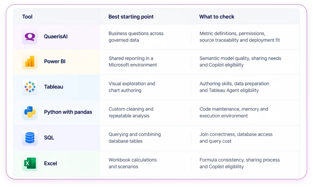
    This guide is an editorial shortlist, not a performance benchmark. QuaerisAI is included because it is our offering, but the numbering does not indicate rank.

    Compare the job before comparing the product
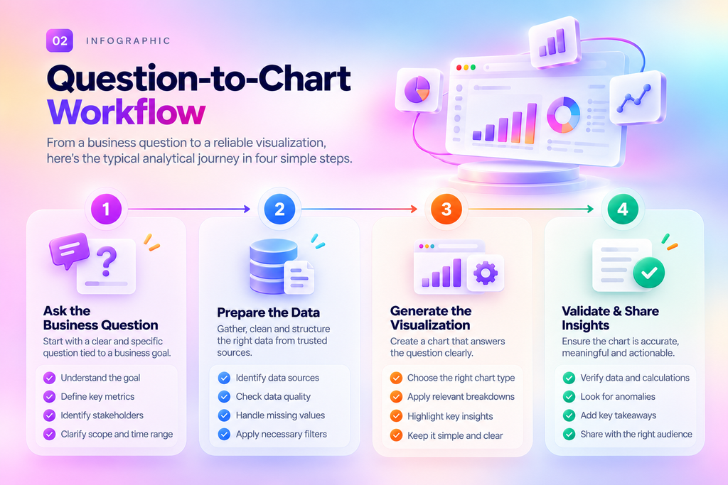
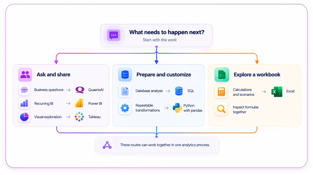
    Analytics work usually moves through preparation, calculation, reporting, and investigation.

    Different tools are stronger at different stages. Before comparing products, compare the job the team needs to do.

    The point is simple: start with the work, then choose the tool.

    A team inspecting workbook formulas has a different need from a team governing metric definitions across departments. A data analyst checking joins has a different job from a business user asking why a campaign changed.

    The wrong tool may still produce an output. The better tool gives the team a result they can understand, check, and repeat.

    A language and a platform are different decisions

    Python and SQL should not be evaluated in the same way as BI platforms.

    Python is a programming language. pandas is an open-source Python library for working with data. SQL is a language used to query databases. They are powerful, but they still require an execution environment, maintenance, access controls, and people who can review the work.

    AI assistance can make coding and querying faster, but it does not automatically turn Python or SQL into governed analytics products.

    For buyers, the practical question is whether the team can maintain the workflow, control access, check the logic, and repeat the result later.

    Start with the question your current setup cannot answer

    Most organizations already have analytics tools. The real buying question is usually about the gap.

    What question is your current setup struggling to answer?

    For some teams, the issue is exploration. Users can see a dashboard, then struggle to ask the next question.

    For others, the issue is repeatability. A useful analysis exists, but it depends on one analyst, one script, or one workbook.

    For regulated or enterprise teams, the issue may be traceability. The result exists, but the team cannot clearly show which definition, source, permission, or calculation produced it.

    A good evaluation should start with a specific workflow, not a generic feature checklist.

    Ask:

    Who asks the question?

    Who owns the metric?

    Who fixes the data?

    Who checks the result?

    Can the workflow be repeated?

    The answers will show where the bottleneck sits.

    Where each tool earns its place

    1. QuaerisAI for governed business questions

    Evaluate QuaerisAI when business users need to ask questions across governed enterprise data.

    A useful test is to start with an ambiguous term such as active customer. Ask the system to define the metric, show the source, and repeat the question with a restricted user.

    The goal is to see whether the workflow respects definitions, permissions, and traceability.

    This is especially relevant when teams need results that can be checked later, rather than one-off outputs that are difficult to reconstruct. [2, 3]

    2. Power BI for shared reporting and follow-up analysis

    Consider Power BI when reports and semantic models already support your Microsoft workflow.

    Power BI is useful for shared dashboards, recurring reporting, and business reviews where the organization has already invested in semantic models and permissions.

    Copilot can assist with reporting, summaries, and data questions, but the experience still depends on the underlying model, capacity eligibility, and enablement.

    A practical test is to use a trusted measure and check whether users can understand the result, share it appropriately, and continue the analysis without creating confusion. [4]

    3. Tableau for visual investigation

    Tableau supports visual investigation and chart authoring.

    It is useful when users need to compare regions, change measures, and inspect how a visual changes when the view changes.

    Tableau Agent can assist with charts, calculations, and filters, but teams should confirm supported operations, deployment eligibility, and access in their own environment.

    A useful test is to request a regional comparison, change the measure, and inspect what stayed constant. [5]

    4. Python with pandas for repeatable data preparation

    Use Python with pandas for recurring cleaning, joins, grouping, reshaping, and tabular analysis.

    It is flexible, but it still needs maintenance. Someone must review the code, manage changes, check AI-generated edits, and test edge cases such as missing values or duplicates.

    The main risk is treating a script as reliable just because it runs.

    A good workflow checks the data before trusting the totals. [6]

    5. SQL for examining the data behind the result

    SQL helps analysts filter, join, and aggregate structured database tables.

    It is useful for checking the data behind reports, dashboards, and AI-generated outputs. It can also help confirm whether the right records are included in a result.

    The common risk is join logic. A query can multiply transactions, exclude records, or produce a misleading total if the relationships are wrong.

    SQL gives control, but it does not guarantee correct analysis by itself. [7]

    6. Excel for collaborative workbook analysis

    Excel supports formula inspection, scenario analysis, and workbook-based collaboration.

    It is familiar and flexible, especially for finance and planning workflows where teams need to see the calculation directly.

    Copilot can assist in Excel depending on license, app, and configuration. Teams should still keep a known reference calculation and review changes before sharing.

    Recurring workbooks need ownership, version control, and review discipline. [8]

    What 2026 research changes about the buying decision

    Enterprise AI adoption is moving from isolated experiments toward broader deployment.

    McKinsey’s August 2026 survey reported enterprise AI scaling rising from 38 percent to 44 percent of respondents. This describes broader adoption, not any analytics product’s market share or effectiveness. [10]
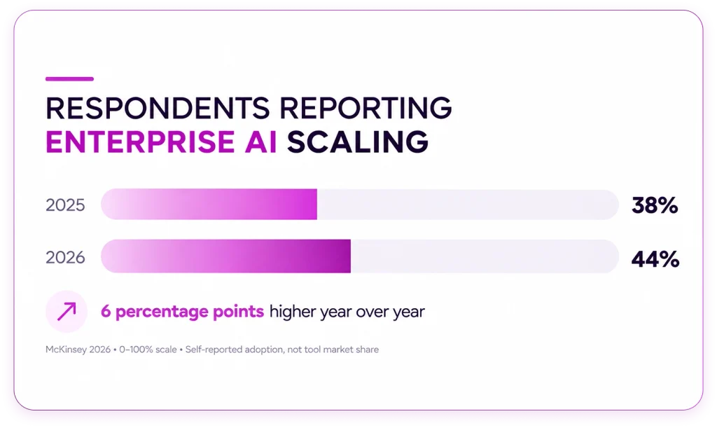
    The practical takeaway for buyers is that AI capability alone is not enough. Teams need to understand whether AI can work inside their definitions, permissions, workflows, and review standards.

    Context is becoming a buying criterion

    A major analytics challenge is getting AI systems to understand business context.

    Alteryx’s August 2026 study reports that 53 percent of surveyed organizations struggle to translate business context into AI workflows. The vendor-sponsored research was based on a Coleman Parkes survey of 1,400 technology leaders. [11]

    For analytics buyers, the practical implication is clear: demos should test more than the interface.

    They should test:

    metric definitions

    exceptions

    access rules

    source visibility

    permission handling

    what happens when the system does not have enough information

    A clean demo is useful. A workflow test is better.

    Research is moving beyond isolated queries

    Analytics evaluation is also moving beyond simple question-and-answer tests.

    The September 2026 BI-Agent and BI-Bench preprint evaluates tasks such as finding tables, transformations, and joins. The authors report below-50 percent accuracy for the frontier LLMs tested, improving with their specialized approach. The benchmark does not compare the six tools in this guide; it supports testing complete workflows. [12]

    That matters because a tool may answer a clean prompt in a demo.

    The real test is whether it can handle the path from question to source, transformation, calculation, validation, and review.

    Product changes can make tutorials outdated

    Analytics products are changing quickly.

    Microsoft retired Excel’s preview COPILOT function on September 14, 2026, while the Copilot pane remains. Power BI and Tableau also offer conversational assistance within established BI environments. [4, 5, 13]

    The lesson is simple: check current product availability before relying on a tutorial, demo, or old implementation note.

    Product packaging, eligibility, licensing, and supported features can change. The evaluation should be based on the current environment your team will actually use.

    Compare workflows with one real business question

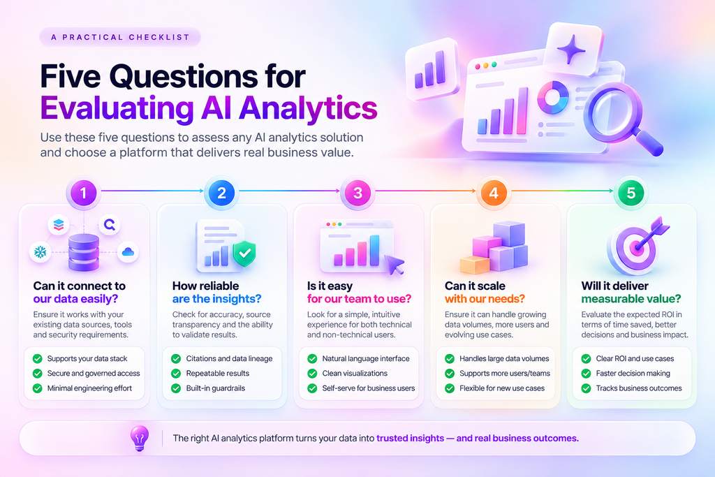
    The best way to evaluate analytics tools is to test one real business question across workflows.

    Some follow-up questions need new modeling or specialist work. Others can be answered with already-approved data and definitions. Both paths are valid, but they should be measured against the same standards.
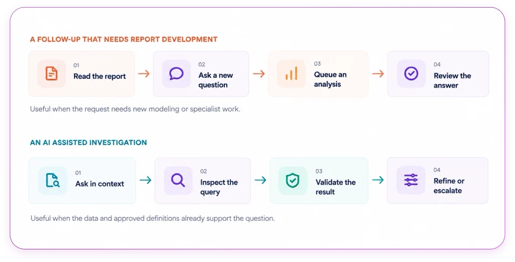
    Figure 3. Two illustrative follow-up paths. Both can exist in the same platform; this is not a timing benchmark.

    Now try a simple test.

    These fictional campaigns use the same period:
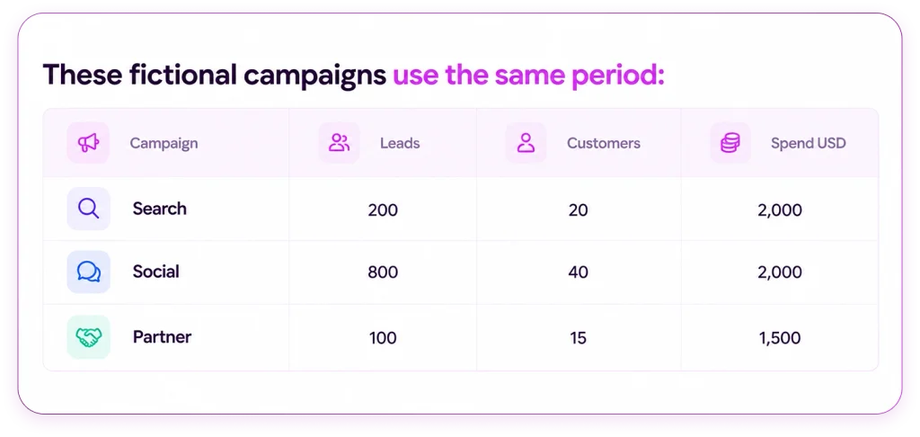
    Ask your chosen tool:

    “Calculate customer conversion rate and cost per customer by campaign. Show the formulas. Then calculate the combined conversion rate. Explain whether these numbers alone justify a budget change.”

    Before calculating, predict which campaign has the highest lead-to-customer conversion rate.

    Then test the follow-up:

    “What if customer counts include duplicates across campaigns?”

    A useful response should request the relevant identifiers or explain the limitation. It should not silently treat those customer counts as unique people if that has not been established.

    Record:

    correctness

    time to a checked result

    analyst help required

    repeatability

    whether the tool explains limitations

    whether it can be tested with fresh data

    whether it respects a restricted user’s permissions

    Check the result, then check the workflow

    The combined conversion rate is 75 customers divided by 1,100 leads, or 6.82 percent, assuming consistent counting rules. Averaging the three campaign percentages gives the wrong combined rate.

    This small example shows why analytics evaluation should go beyond whether the tool returns a number.

    Partner has the highest conversion rate. Social has the lowest cost per customer. Neither finding establishes profitability or proves that the budget should change. A real decision would need more evidence, including customer value, attribution, and duplicate handling.

    What to measure in the evaluation

    When testing any analytics workflow, separate the measures.

    Look at:

    whether the result was correct

    how long it took to reach a checked result

    how much analyst help was needed

    whether the result could be repeated

    whether definitions were clear

    whether permissions were respected

    whether the source could be inspected

    whether the tool explained limitations instead of guessing

    Then repeat the test with fresh data and a restricted user.

    That final step matters. A workflow that works for an admin user may fail when access rules, incomplete data, or ambiguous terms are introduced.

    Choose the workflow your team can trust and repeat

    The best analytics tool is not always the most advanced one.

    It is the one that fits the question, the user, the data, and the review standard.

    Use Excel when the work belongs in a workbook and the logic needs to be inspected. Use SQL when you need to examine structured data behind the result. Use Python with pandas when the work requires repeatable preparation and custom analysis. Use Power BI or Tableau when the team needs shared reporting and visual analysis.

    Evaluate QuaerisAI when business users need governed questions across enterprise data with definitions, permissions, and source traceability in the workflow.

    To evaluate QuaerisAI, bring a real question, the definition behind it, and a reference result. Ask for a checked result, then change the question and permissions. Judge the workflow by what it improves. [2]

    That is the clearest way to compare analytics tools in 2026: start with the work, test the workflow, and choose the tool your team can trust enough to repeat.
  • The Language Between LLMs and Charts

    The Language Between LLMs and Charts

    TL;DR

    • A convincing chart can still answer the wrong question. Terms such as “performance,” “average,” and “underperformer” require clear business definitions before AI generates a visualization.
    • Preserve intent from question to chart. Metric selection, calculations, filters, comparisons, and visual emphasis must remain aligned. Low revenue, for example, does not necessarily mean a region missed its target.
    • Structured specifications make charts easier to inspect and revise. ThoughtSpot’s ChartSpec separates AI interpretation from software-driven chart construction and validation. It is a vendor implementation, not a universal industry standard.
    • Follow-up questions should maintain analytical continuity. Changing a highlight or reporting period should preserve other relevant choices unless the user requests otherwise.
    • Chart specifications alone cannot establish trust. Enterprise analytics also needs consistent business definitions, appropriate access controls, reliable calculations, and traceability.
    • Conversational analytics is evolving. The blog discusses Google Cloud, Tableau, and Microsoft approaches that connect natural-language interaction with semantic models, agents, or approved visual answers.
    • Evaluate beyond the first chart. Ask a business question, request a target comparison, change the reporting period, ask why something is highlighted, and inspect whether the interpretation remains consistent. Ambiguity should trigger clarification.
    • Quaeris.AI’s focus is governed agentic analytics. Its positioning connects business context, trusted AI agents, and controlled decision support. Specific capabilities should be assessed through demonstrated product workflows.

    The central takeaway: Trustworthy AI analytics must help users understand why an answer deserves confidence—not simply produce charts quickly.

    Building Trustworthy AI Analytics for Enterprise Decisions

    The Language Between LLMs and Charts: Why Enterprise AI Needs More Than an Answer

    Some of the most dangerous words in enterprise analytics are the shortest ones. Average. Performance. Underperformer. Each sounds precise. Each hides a decision that changes what a chart actually says.

     Marketing sees a campaign performing exceptionally well. Finance questions the revenue calculation. Sales asks why existing customers were included in a new-business comparison.

    Everyone is looking at the same visualization. Yet everyone may be interpreting a different answer.

    This is one of the challenges of conversational analytics: An AI system can generate a chart that looks convincing without necessarily capturing the business question correctly.

    Large language models (LLMs) make it easier than ever to ask questions in natural language. You can type, “Show me sales by region, highlight the underperformers, and add an average line.” But turning that request into a reliable business answer requires more than generating a chart.

    Which sales metric should be used? What defines an underperformer? Should the average be calculated across regions or weighted by sales volume? Which data should the user be allowed to access?

    These decisions determine what the visualization communicates.

    The missing piece is a structured connection between human intent, business meaning, analytical calculations, and visual representation.

    And as enterprise organizations move toward agentic analytics, that connection becomes increasingly important.

    The Real Problem: An LLM Can Understand a Question. Can It Preserve Its Meaning?

    A natural-language request often appears simple.

    “Show campaign performance by region, highlight the underperformers, and add an average.”

    But what does performance mean?

    • Revenue generated?

    • Qualified leads?

    • Conversion rate?

    • Return on advertising spend?

    And what does underperformer mean?

    • A region below its target?

    • A region performing below the company average?

    • A region declining compared with the previous period?

    Even the word average requires context. An average across regional revenue may answer a different question from an average transaction value.

    Before a visualization is created, the system needs to resolve these ambiguities.

    This matters because a chart can be technically well-rendered and still answer the wrong question.

    Consider a sales manager who wants to identify regions missing their targets.

    A chart that simply highlights the shortest revenue bars could mislead the manager. A smaller region may have lower revenue but still exceed its target, while the region with the highest revenue may be underperforming against its own goal.

    Revenue determines the bar length. Performance against target determines the emphasis.

    The distinction is not cosmetic. It changes the business interpretation.

    From Business Question to Reliable Visualization

    A dependable AI analytics experience needs a way to preserve the meaning of a user’s request throughout the analytical process.

    Each stage addresses a different potential failure.

    A metric can be defined incorrectly. A calculation can use the wrong population. A chart can emphasize a comparison that does not match the question. A visual can be technically correct but difficult to interpret.

    The objective is not merely to generate an attractive chart. It is to create a visual representation that users can examine, question, and refine.

    What ChartSpec Teaches Us About AI-Generated Charts

    ThoughtSpot’s ChartSpec provides an example of how a structured language can connect analytical intent with visualization.

    According to ThoughtSpot’s explanation, ChartSpec describes visual elements and relationships, allowing software to construct and validate chart structures. It separates the model’s interpretation from the code that generates the visualization.

    This approach illustrates an important principle: AI should not have to communicate its entire analytical intent through an unconstrained visual output.

    A structured representation can make parts of that intent explicit, including:

    • Which fields are being used.

    • How data is grouped or compared.

    • Which calculations are applied.

    • What visual emphasis is required.

    • How follow-up changes should be handled.

    For example, a user might say: “Keep the same comparison, but highlight regions below target.”

    The intended change is narrow. The measure, reporting period, and population should remain consistent unless the user requests otherwise.

    A structured representation provides a way for software to distinguish the requested edit from an unintended change to the analysis.

    ChartSpec is ThoughtSpot’s implementation, not an established universal industry standard. Its broader lesson is that the meaning behind a chart needs a representation that systems can inspect and revise.

    Why Business Context Matters More Than Ever

    The language between LLMs and charts is only one part of the larger enterprise analytics challenge.

    A chart specification can describe how a metric should be displayed. It does not, by itself, determine whether the underlying metric has the correct business definition or whether the user should have access to the data.

    These responsibilities must work together.

    1. Business definitions

    Two departments may use the same term but mean different things. For example, revenue could refer to recognized revenue, billed revenue, or a particular reporting period. AI analytics needs access to the relevant business definitions to avoid confusing similar concepts.

    2. Governed access

    Enterprise data is not universally accessible to every user. Role-based permissions and appropriate access controls are important when analytics systems interact with sensitive business information.

    3. Calculation consistency

    A chart should use the appropriate calculation for the question. An average, growth rate, or comparison can produce different interpretations depending on the underlying data and formula.

    4. Traceability

    When a business user questions an insight, they should have a way to understand the basis of the answer where the system supports it.

    Together, these considerations point toward a broader principle:

    Trustworthy AI analytics requires more than conversational interaction. It requires governed meaning, reliable calculations, and transparent analytical behavior.

    What the Industry Is Moving Toward?

    Developments across the analytics industry demonstrate that conversational analytics is expanding beyond simple question-and-answer experiences.

    Google Cloud has described conversational analytics capabilities in BigQuery and Looker, including workflows involving data exploration and agents. Tableau has discussed conversational experiences grounded in semantic models and connections to external agents. Microsoft Power BI includes verified answers for recurring questions through approved visual responses.

    These approaches operate at different layers of the analytics experience. They do not establish a shared industry-wide chart specification standard.

    However, they illustrate an important direction: enterprises need ways to combine natural-language interaction with business definitions, data access, and consistent analytical outputs.

    For organizations evaluating AI analytics platforms, the important question is not simply: “Can the system generate a chart?”

    It is: “Can the system preserve the meaning of my business question and help me trust the answer?”

    From AI-Generated Insights to Governed Agentic Analytics

    This is where the conversation extends beyond chart generation.

    Enterprise teams increasingly want AI to do more than retrieve information. They want systems that can help investigate trends, identify exceptions, explain performance changes, and support business decisions.

    But increased autonomy also raises important questions:

    • Which data can an agent access?

    • Which business definitions should it use?

    • How are calculations validated?

    • Can users understand the basis of its conclusions?

    • What happens when the question is ambiguous?

    At Quaeris.ai, our positioning around Governed Agentic Analytics is built around the importance of trusted analytics, business context, and controlled AI-driven decision support.

    Our perspective is that enterprise AI should not be defined only by how naturally it can respond. It should also be evaluated by how reliably it operates within the business’s definitions, permissions, and governance requirements.

    That means the conversation should move beyond “Ask your data anything” toward a more meaningful question:

    Can your AI help your teams make decisions using analytics they can trust?

    Quaeris.ai’s specific capabilities, integrations, and validation mechanisms should be evaluated against this principle and demonstrated through real product workflows.

    A Practical Way to Evaluate AI Analytics

    The next time you evaluate an AI-powered analytics experience, don’t stop after the first chart.

    Try a short sequence of follow-up questions.

    Step 1: Ask a business question

    “Show campaign performance by region.”

    Step 2: Request a comparison

    “Highlight regions performing below their targets.”

    Step 3: Change the reporting period

    “Now show the same analysis for the previous quarter.”

    Step 4: Ask for an explanation

    “Why is this region highlighted?”

    Step 5: Inspect the answer

    Check whether the definitions, calculations, filters, and visual emphasis still match the original intent.

    This sequence can help reveal whether the system handles analytical continuity and transparency effectively.

    A reliable experience should also be willing to ask for clarification when the question is ambiguous.

    For example: “When you say ‘best campaign,’ do you mean revenue, profitability, or conversion rate?”

    Sometimes the most useful response an AI system can provide is not a chart. It is a clarifying question.

    The Future of AI Analytics Is More Than Faster Charts

    The evolution of conversational analytics is not simply about making chart generation faster.

    It is about making the relationship between questions, data, calculations, and visual explanations more dependable.

    As AI analytics becomes part of enterprise workflows, users will increasingly expect to:

    • Understand what a metric represents.

    • Inspect the basis of an analytical answer.

    • Refine a visualization without accidentally changing the underlying question.

    • Work with data within appropriate governance controls.

    • Move from insights toward informed business decisions.

    A structured language between LLMs and charts is one possible component of that future. It helps make visual intent more explicit and provides a basis for examination and revision.

    But reliable enterprise analytics requires the larger system to work together: business meaning, governed data, analytical reasoning, and visualization.

    The real test of AI analytics begins after the first chart.

    When someone points to a visualization and asks, “Why should I believe this?”—the system should have a meaningful way to help them understand the answer.

    How Quaeris.ai Approaches Trusted Analytics

    Enterprise decisions deserve more than fast answers. They need context, consistent metrics, and governance.

    Quaeris.ai’s Governed Agentic Analytics positioning focuses on connecting enterprise analytics with trusted AI agents and decision intelligence.

    Explore how Quaeris.ai can support your organization’s approach to governed analytics and AI-driven decision-making.

    Ready to Explore Governed Agentic Analytics? Discover how Quaeris.ai approaches trusted analytics and enterprise decision intelligence.
  • Self-Service Analytics for Retail

    Self-Service Analytics for Retail

    TL;DR

    Retail self-service analytics should be measured by whether users reach usable answers with less rework, not by dashboard volume alone. PAYBACK’s example shows why shared definitions, access controls, source evidence, and a clear escalation path matter when campaign teams need to move from report to decision.

    From Coupon Counts to Answers That Drive Decisions

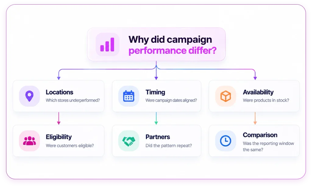
    A loyalty manager can already see total coupon redemptions, but the real question is why certain stores underperformed. Was it a stock issue? A timing issue? A customer eligibility issue? Or did the campaign simply fail to drive the expected behavior? 

    Answering that follow-up usually means another report request. 

    By the time the answer arrives, the next promotion may already be underway. 

    That is the practical problem self-service analytics is supposed to solve. The value is not just giving users another dashboard. It is helping business teams investigate approved data, ask the next question, and move toward a decision without waiting for every variation to become a specialist request. 

    PAYBACK’s experience offers a useful example for retail marketing, loyalty, and analytics leaders thinking about what effective self-service should look like. 

    What PAYBACK Changed 

    According to ThoughtSpot’s PAYBACK customer story, PAYBACK’s earlier reporting environment required technical intervention even for small adjustments. Reporting backlogs delayed answers, and users relied on email and spreadsheets to get the views they needed. 

    With ThoughtSpot, employees could explore coupon performance at individual stores on specific days in near real time. The story also describes independent performance monitoring across retail partners and more time for analysts to focus on strategic work. 

    PAYBACK’s reported self-service footprint included: 

    • 70+ major retail partners 
    • 300+ user-created Liveboards 
    • 150 standard reports 

    These figures are useful as adoption indicators, but they should not be read as active-user rates, answer accuracy measures, or financial return. They show scale and content creation, not the full quality of decision-making. 

    That distinction matters. 

    Self-service analytics should not be evaluated only by the number of dashboards or reports created. A better question is whether users can reach usable answers with less rework, while still relying on shared definitions, appropriate access, and evidence they can inspect. 

    The Real Test Is the Follow-Up Question 

    Retail teams rarely stop at the first answer. 

    A campaign dashboard may show that one store group had lower coupon redemptions. But the next questions come quickly: 

    Which locations underperformed? 

    Were campaign dates aligned? 

    Were the products available? 

    Were customers eligible? 

    Did the same pattern appear across partners? 

    Was the comparison based on the same reporting window? 

    Before interpreting the result, the team also needs to agree on the measure itself. “Redemption rate” can mean different things depending on the denominator. It could be issued coupons, activated offers, or eligible customers. 

    If those definitions are unclear, self-service can spread confusion faster than traditional reporting ever did. 

    This is where retail analytics needs more than access. It needs a workflow that helps users understand what they are asking, what data is being used, and whether the answer is reliable enough to support action. 

    Why Self-Service Still Needs Guardrails 

    Self-service analytics does not remove the need for analysts, definitions, or governance. It changes where those controls need to show up. 

    A business user should be able to explore approved data without opening a ticket for every follow-up. But that exploration still needs boundaries. 

    The system should help users confirm: 

    • which metric definition is being used 
    • which dates and stores are included 
    • which source data supports the answer 
    • whether the user has access to the right scope 
    • when the question needs analyst review 

    For example, a stock shortage may call for an operational fix. A question about whether a promotion drove incremental sales may require a comparison group and deeper analyst support. Higher redemptions alone do not prove incremental revenue. 

    A useful self-service workflow should make that distinction clear. 

    A Better Way to Pilot Self-Service Analytics 

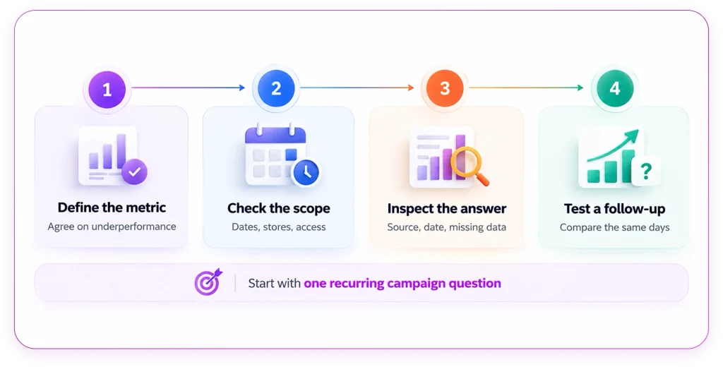
    For retail teams evaluating self-service analytics, the best pilot does not start with a broad rollout. It starts with one recurring campaign question that already creates reporting friction. 

    For example: 

    Which stores underperformed during our latest coupon campaign? 

    From there, the team can test the workflow end to end. 

    Figure 2  A pilot that follows the question through to review. 

    Start by defining the metric. Confirm what “underperformance” means and how the calculation is handled. 

    Next, check the scope. Confirm campaign dates, eligible customers, participating stores, and user permissions. 

    Then inspect the answer. Review the source, metric definition, reporting date, and any missing information. 

    Finally, test a follow-up that changes the decision. For example: 

    Does the difference remain when we compare the same campaign days? 

    This kind of pilot is more useful than a polished demo because it shows whether the system can support a real business investigation. 

    Measure Useful Independence 

    A strong self-service pilot should not only ask whether users can create more views. It should measure whether users reach better answers with less rework. 

    Before the pilot begins, teams should agree on success criteria. 

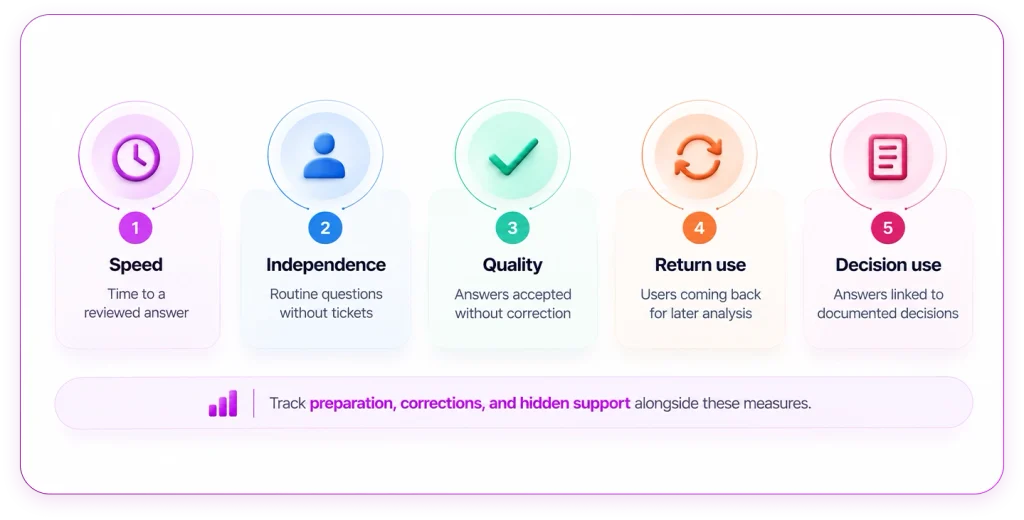
    Useful measures include: 

    • time from question to reviewed answer 
    • routine questions resolved without a specialist ticket 
    • answers accepted without correction 
    • users returning for later analysis 
    • answers linked to a documented business decision 

    This creates a more practical basis for expansion than dashboard count alone. 

    It also keeps teams honest. A shorter reporting queue is only useful if the work has not simply moved elsewhere, into more preparation, more corrections, or more hidden support from analysts. 

    Where QuaerisAI Fits 

    QuaerisAI helps teams connect business questions to definitions, source traceability, and access controls. 

    For retail and CPG teams, that can support use cases across merchandising, inventory, demand, and trade-promotion analysis. The useful test is not whether the platform can answer a polished demo question. The useful test is whether it can support the way campaign teams actually investigate performance across the systems they already use. 

    A QuaerisAI demo should make the answer inspectable. 

    For a question like “Which stores underperformed during our latest coupon campaign?”, the review should show: 

    • how underperformance is defined 
    • which source data supports the answer 
    • which dates and stores are included 
    • what scope the user is allowed to see 
    • whether the evidence is strong enough to act on 
    • when a follow-up requires analyst review 

    That is the difference between self-service as dashboard access and self-service as a decision workflow. 

    Give the Next Question a Clear Path 

    Retail analytics does not fail because teams lack dashboards. It often fails because the next question has nowhere clean to go. 

    Self-service works when users can continue a useful investigation, understand the answer, and recognize when specialist help is needed. 

    Start with one campaign question that repeatedly returns to the reporting queue. Define what a trustworthy answer requires. Then test the workflow against it. 

    Bring one recurring campaign question to a QuaerisAI demo. Review the metric definition, source data, access scope, and follow-up workflow behind the answer.